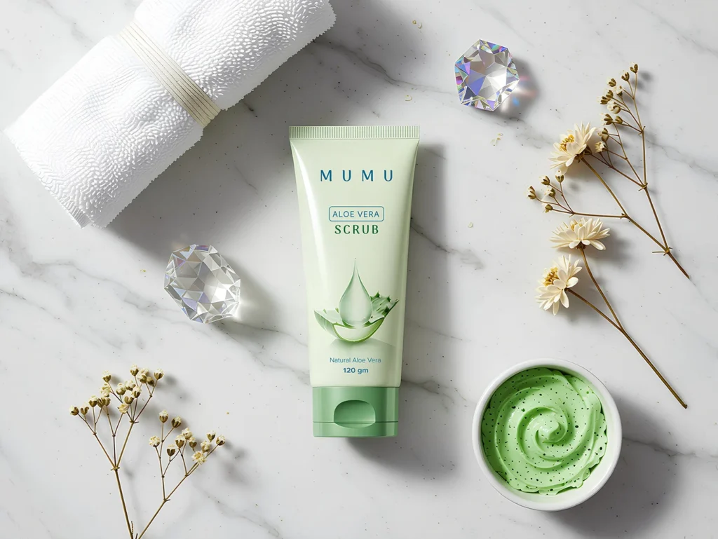
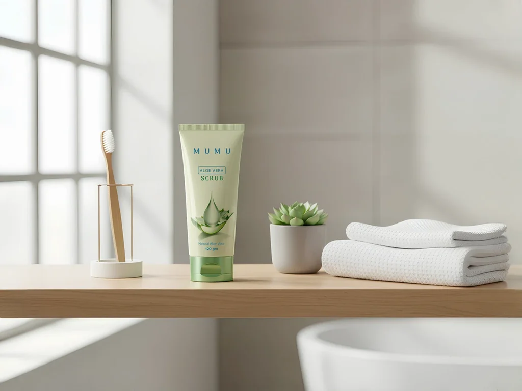
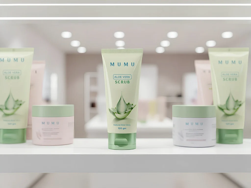
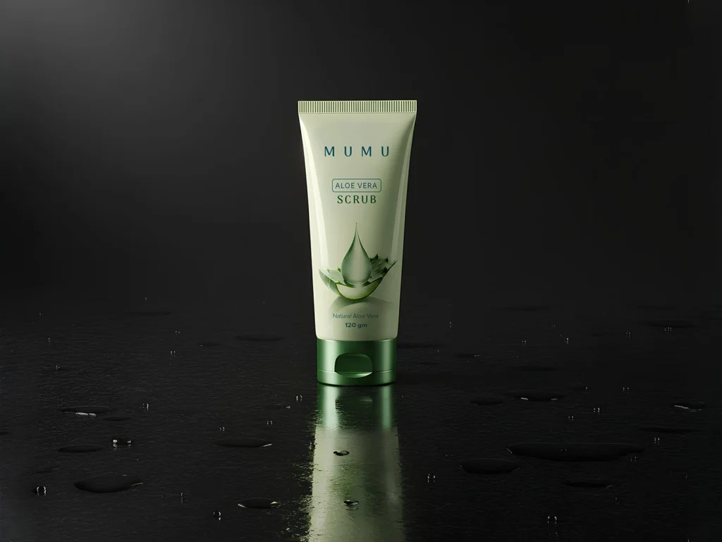
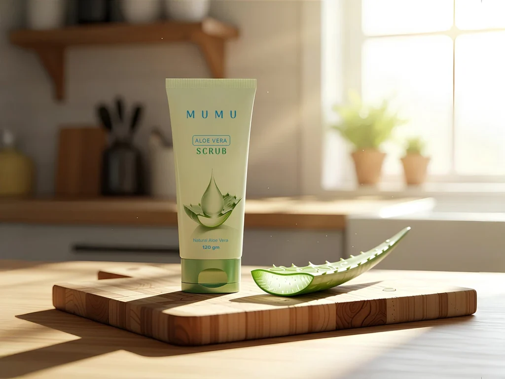
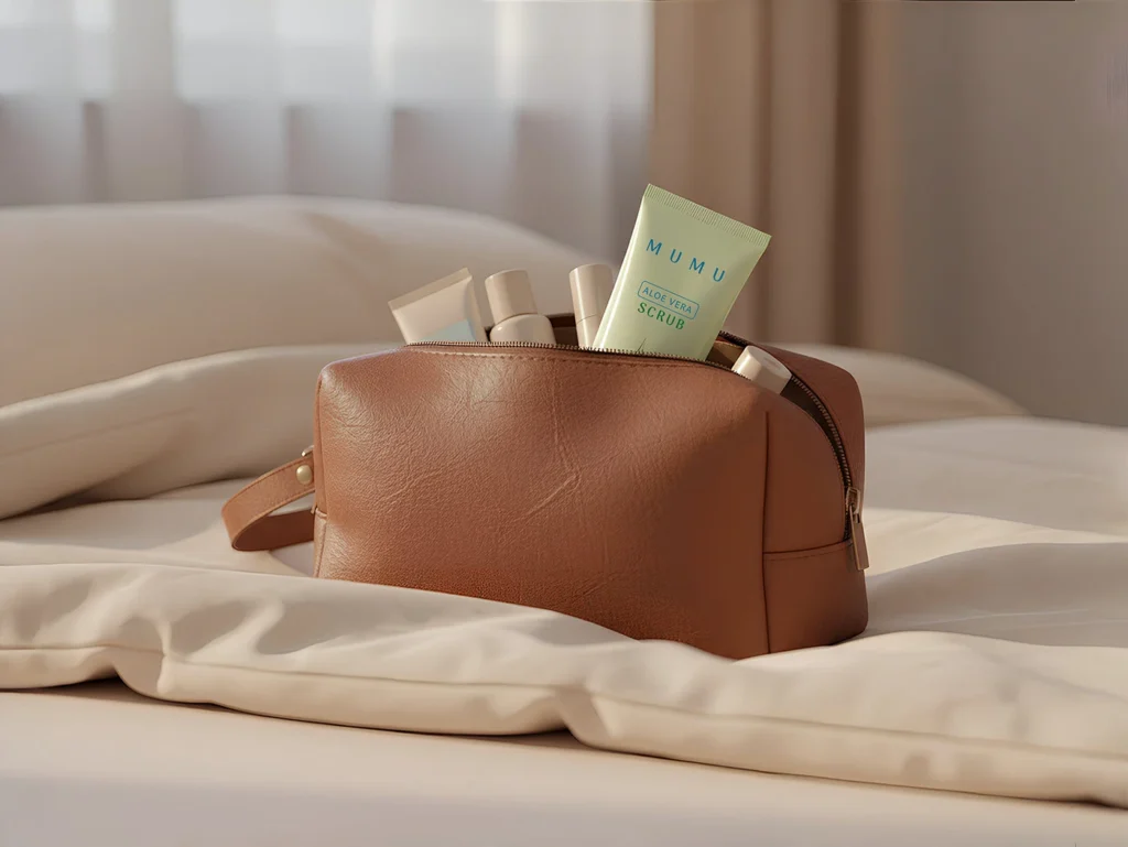
A minimalist and natural packaging design for Mumu Aloe Vera Scrub, crafted to communicate purity and freshness on the shelf and in the home.
This project involved developing a complete visual identity for a skincare product targeting consumers who seek gentle, natural solutions. The goal was to create a design that felt both trustworthy and modern, avoiding the clichés of overly “earthy” natural brands.
My design process focused on a clean hierarchy and a soft, natural color palette to reflect the gentle efficacy of the aloe vera ingredient. The result is packaging that is instantly recognizable, communicates its core benefit clearly, and builds a foundation for a broader brand identity.
The Challenge:
To design skincare packaging that stands out through simplicity and clarity, effectively communicating the product’s natural composition and gentle purpose to its target audience.
The Solution:
A minimalist layout that prioritizes readability and brand recognition. The use of soft greens and clean typography creates a fresh, calm, and premium feel, directly connecting the product’s visuals to its promised experience.
Key Design Highlights:
Clean Visual Hierarchy: Ensuring “Aloe Vera” and the product type (“Scrub”) are the primary focus for immediate consumer understanding.
Evocative Color Palette: Soothing greens and neutral backgrounds to evoke feelings of nature, purity, and gentle care.
Balanced Typography: A thoughtful combination of serif and sans-serif fonts to establish a personality that is both reliable and contemporary.
Scalable Brand System: The design is structured to allow for easy adaptation into a full product line for future brand gr
owth.


