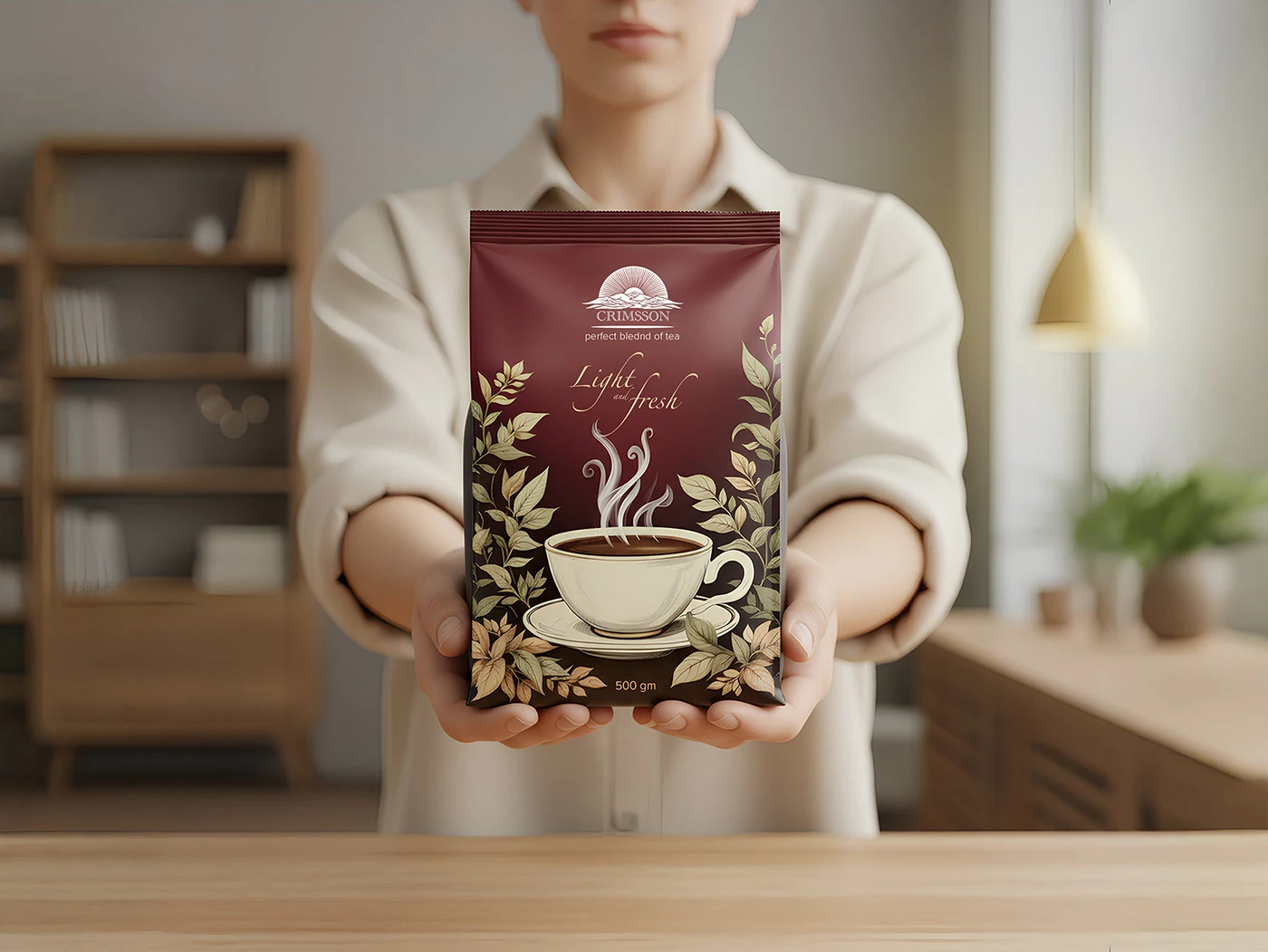
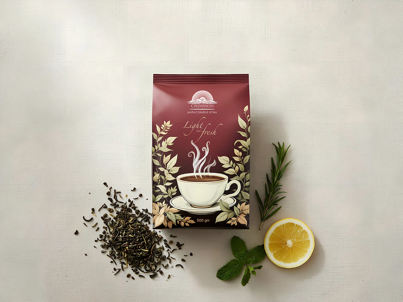
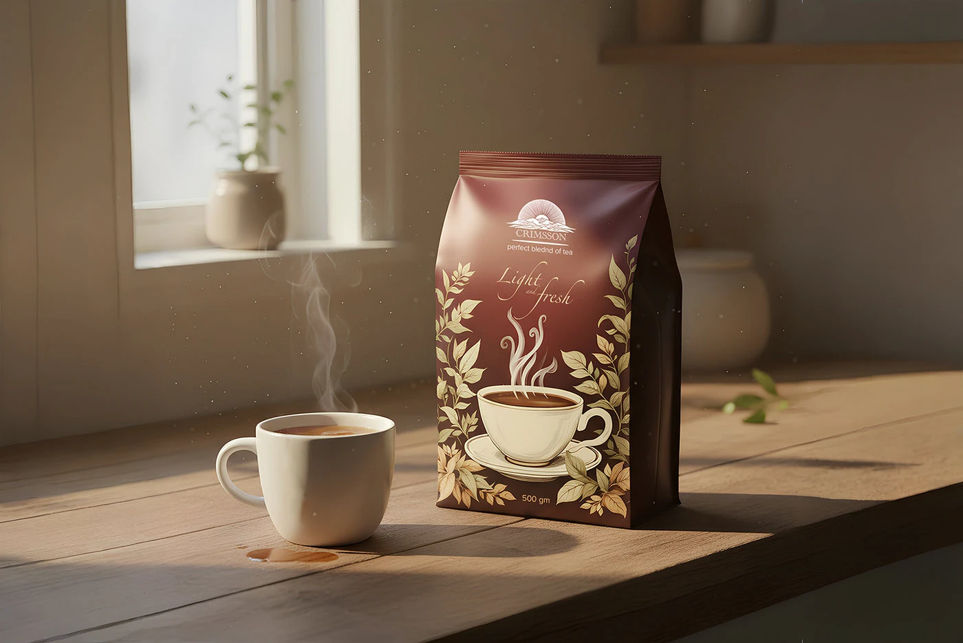
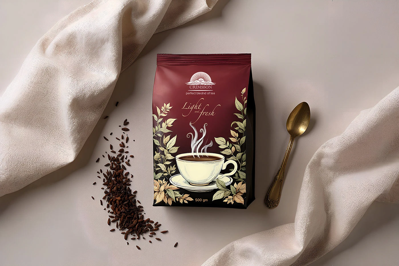
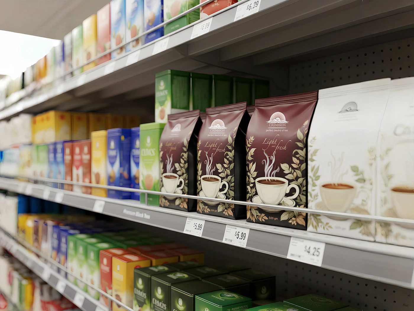
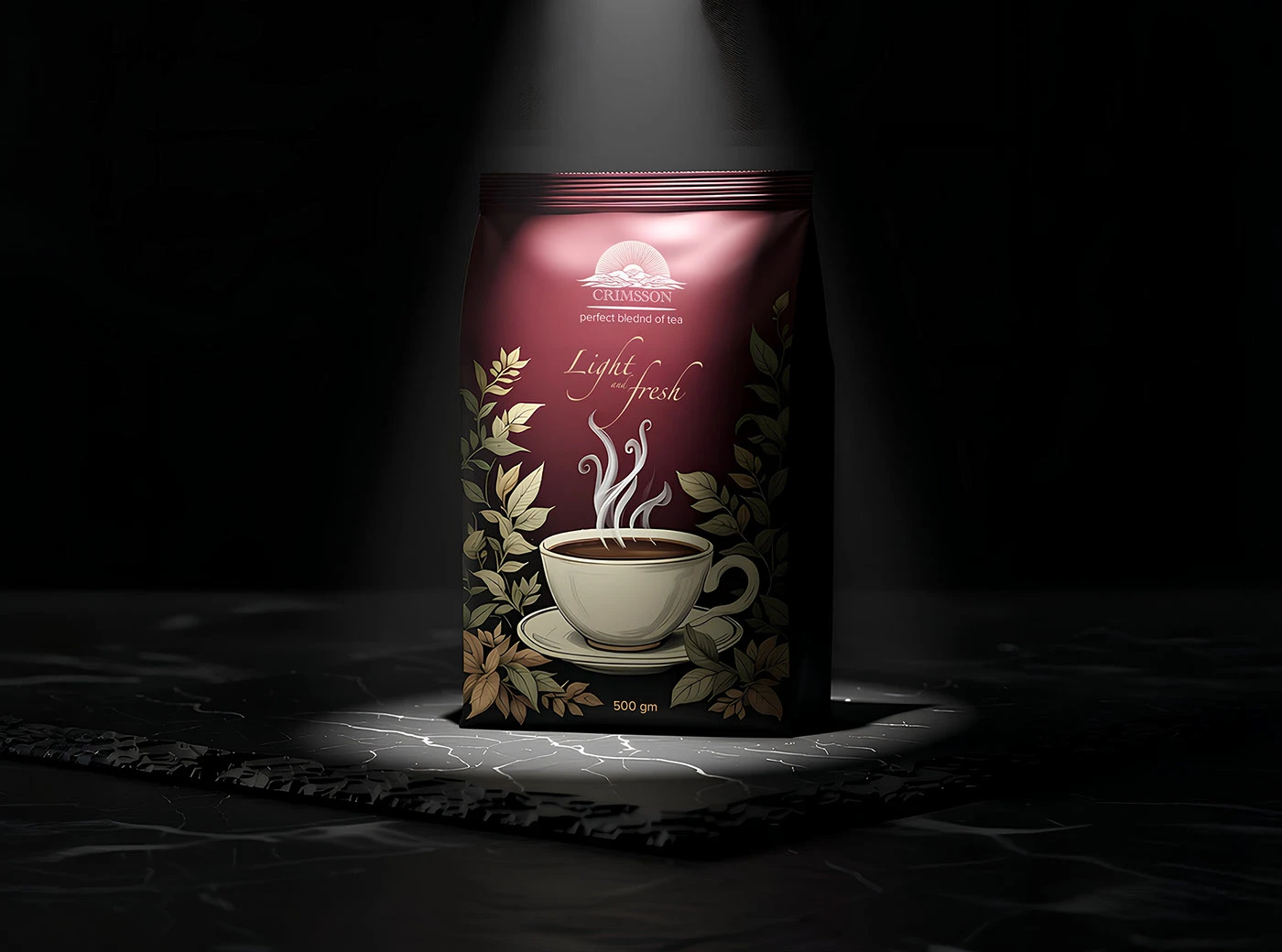
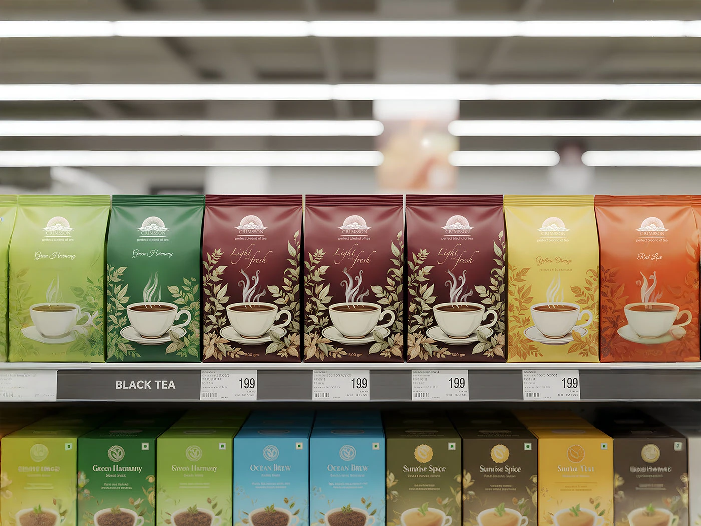
A sleek, minimalist packaging design for CRIMSSON Tea, embodying the brand’s promise of a “perfect bleeding of tea” for a “light” and “fresh” experience.
This project centered on creating a sophisticated identity that speaks to discerning tea drinkers. The design uses a clean, uncluttered aesthetic to reflect the purity and refined quality of the tea within. The deliberate typographic hierarchy and minimalist approach convey a sense of modern luxury and clarity, ensuring the product’s core attributes are communicated instantly and elegantly.
Design Concept & Philosophy: The core concept was “Clarity in Purity.” The design strips away unnecessary elements to focus on the essence of the product: a superior tea blend. The minimalist layout and confident typography allow the brand name and its unique selling points—”perfect bleeding of tea” and “light fresh”—to stand out with purpose and sophistication.
Key Design Elements:
Confident Typography: A strong, bold logotype (“CRIMSSON”) establishes brand presence, while supporting phrases use contrasting fonts to create a clear visual hierarchy and premium feel.
Minimalist Layout: Ample negative space is used strategically to create a sense of premium quality and allow the key messages to breathe.
Subtle Brand Messaging: The unique phrase “perfect bleeding of tea” is prominently featured, creating intrigue and signaling a high-quality, full-flavored blend.
Product Clarity: The net weight “500 gm” is cleanly integrated, completing the essential product information with a no-nonsense approach.